

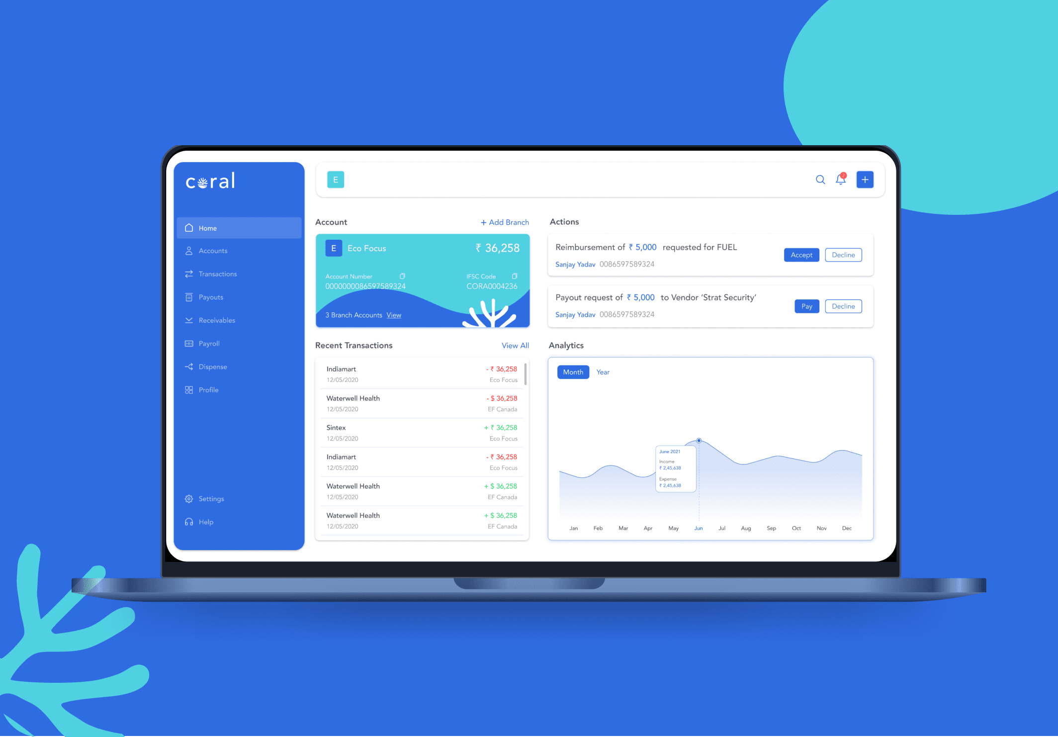
Design System
Overview
The Verida Design System is a comprehensive toolkit designed to create cohesive, scalable, and user-centric digital experiences.
It provides reusable components, detailed style guidelines, and robust documentation, ensuring consistency and efficiency across platforms.
Initial Design Brief

Inconsistent Visual Language
Variations in typography, colors and styles

Component Framework Issues
Variability in spacing, absence of atomic-level elements, and no automated layout system.

Lack of Guidelines and Documentation
Missing design system and lack of established rules for implementation.
How was the design system built?

Design Philosophy
The financial information and options in a simplified manner. This helps in making informed decisions from the consumer's end.
Simplify Data Visualization
Financial application are high cognitive load lead and the users work in high stress environment. So consuming and analyzing data need to be simplified for accelerating relevant actions
Build Trust through Design
The emotional triggers slows down the operational efficiency in due coarse. The interface should elude confidence to the users with required status updates, feedback mechanism and consistent and seamless across platforms
User Impact
Clear visual status for efficient navigation and quick actions
Easy to access options - reduce click throughs
Easy Discoverability of content: Clear differentiation of content based on context
Business Impact
Better operational efficiency - Better resource utilization
Minimal error resolution - Accelerated effort with more accuracy
Reduce support dependency - Reduce cost on training and support
Colours

Foundations
The color palettes are carefully crafted to maintain balance, enhance text readability, and clearly differentiate between user interface elements and system components.
Balance
Although our brand colours are warm in nature; we are minimizing the usage of strong bold colours to avoid multiple focal points. We are striking a balance with brand identity with including a sub set a colours for digital scape.
Trust, Security & Scalability
We are using cool pallet to enable a stable and calm environment amongst the chaos. These colors evoke a sense of trust, security, and stability—crucial emotions for users managing finances, which often come with stress or anxiety.
Readability
Typography and symbols should meet screen readability standards, ensuring clarity for users.
Visual Hierarchy
Highlight interactive elements, define their relationships, and prioritize their importance, with key components being the most prominent.
Brand Expression
Use brand colors strategically in pivotal moments to strengthen the visual identity and communication.

Typography
Foundations
For our design system, we selected a sleek and versatile typeface. Open Sans emerged as our choice for its ideal geometric structure and well-balanced inter-character spacing. This adaptable typeface offers a range of weight variations, making it perfect for both headers and body text. Additionally, we ensured compatibility with right-to-left alignment, catering to the requirements of Arabic script and layouts.

Iconography
Foundations
System icons are crafted to be simple, modern, and approachable, with a touch of personality, focusing on conveying essential characteristics in a minimalistic style. Each icon is stripped down to its simplest form, featuring bold, geometric shapes. They retain a symmetrical and consistent design, ensuring clarity and readability even at smaller sizes.

Spacing & Padding

Exceptions


Grids and Spacing
Foundations
Grids and spacing establish a structured framework for layout design, ensuring visual consistency and harmonious alignment of elements across the interface.

Buttons

Atoms
Buttons are controls that let users take action, make choices, and move forward. They serve as key interaction points, providing clear and accessible pathways for users to achieve their goals.
Usage
Use buttons to let users take action, make choices, and move forward. Buttons can navigate to other pages while completing an action like purchasing or submitting a form.
Anatomy

Layout and Spacing


Controls
Atoms
Radio Button

Usage
Radio buttons allow users to select one option from a set of mutually exclusive choices. They are used when only one response is applicable.
Checkbox

Usage
Checkboxes allow users to select one or more options from a list of choices. They are used for tasks like agreeing to terms, subscribing to multiple features, or selecting preferences. Each checkbox operates independently, enabling users to check or uncheck options as needed. Clear labeling is essential for ensuring users understand what each option represents.
Tabs

Usage
A section selector allows users to navigate between different sections or categories within a user interface. Typically presented as tabs, buttons, or dropdowns, it enables users to switch views or content quickly. This feature enhances usability by organizing information and helping users find what they need efficiently without overwhelming them with too much content at once.
Input Fields
Atoms

Usage
A calendar displays dates and events, allowing users to view, select, and manage time-related information easily. It often includes features for navigating between months or years, enhancing organization and scheduling efficiency.

Progress Bar

Molecules

Usage
Progress bar visually indicates the completion status of a task, such as file uploads, form submissions, or loading processes. It provides users with real-time feedback on how much of the task has been completed and how much is left, enhancing user experience by managing expectations. Progress bars can motivate users to stay engaged and reduce uncertainty during waiting periods.
Personal Reflections and Learnings
From Fragmented to Fluid: Designing a Scalable System for Fintech Excellence
Building a Robust Component Framework
Inconsistent spacing and lack of atomic elements revealed the need for a structured system. By building modular, reusable components with defined spacing, grids, and responsive behavior, we ensured design consistency and improved collaboration. Brand colors were applied strategically to highlight key interactions while maintaining accessibility and strengthening visual hierarchy.
Documenting component usage and behavior helped reduce ambiguity during implementation. The framework now serves as a single source of truth for designers and developers, streamlining workflows across teams.
Iterative Design and Testing
A minimalist, information-first approach helped simplify complex financial data and reduce cognitive load. Clear typography, modular data components, and intentional visual feedback enhanced usability and built user trust. Every design decision focused on empowering users to make informed decisions with ease and confidence.
User testing and feedback loops were integral in validating design choices. This continuous refinement ensured the system remained intuitive, accessible, and aligned with real user needs.
Explore More

Available for new projects
Let's make the digital world a better place together!
I'm always excited to collaborate on new projects and innovative ideas. Whether you have a question or just want to say hi, feel free to reach out!
